Diving into Data:

Examining O-rings from NASA’s Challenger Flights

cmdstanpy
python
bayesian
stan
pandas
Published

April 25, 2026

I have been in some discussions recently about datasets that spark interest in data science students where they can learn statistics and data science skills. This got me reflecting on classes I took during my doctoral program and one “dataset” stuck with me because of the discussion around model choices and implications that students may not think about when looking at datasets with less stakes.

I wanted to cover a small dataset that discusses some of the issues that arose from data on the Challenger space shuttle. I created the data from this paper (Citation at end of the post). If you are not familiar with the Challenger space shuttle, it was the space shuttle that experienced a catastrophic malfunction due to the space shuttle’s O-rings that resulted in an explosion that claimed the lives of all of those onboard. More information on the crew can be found here, with one crew member being Ronald E. McNair, of which the McNair Scholars program is named after.

For the purposes of this post, I wanted to mainly focus on the relationship of temperature and the damage index mentioned in the link above as the main culprit for the catastrophe was the O-rings failing at different temperatures.

Code
import numpy as np
import pandas as pd
import matplotlib
import matplotlib.pyplot as plt
import plotnine as pn
import joblib
from pyhere import here
from janitor import clean_names
from great_tables import GT as gt
import os
import arviz_base as azb
import arviz_plots as azp
import arviz_stats as azs
import joblib
from cmdstanpy import CmdStanModel

jpcolor = 'seagreen'

pd.set_option('display.max_columns', None)
pd.options.mode.copy_on_write = True

I took some time to write out some of the NASA data into a dataframe. As we’ll see, this can lead to some issues that we’ll have to adjust in our dataframe.

Code
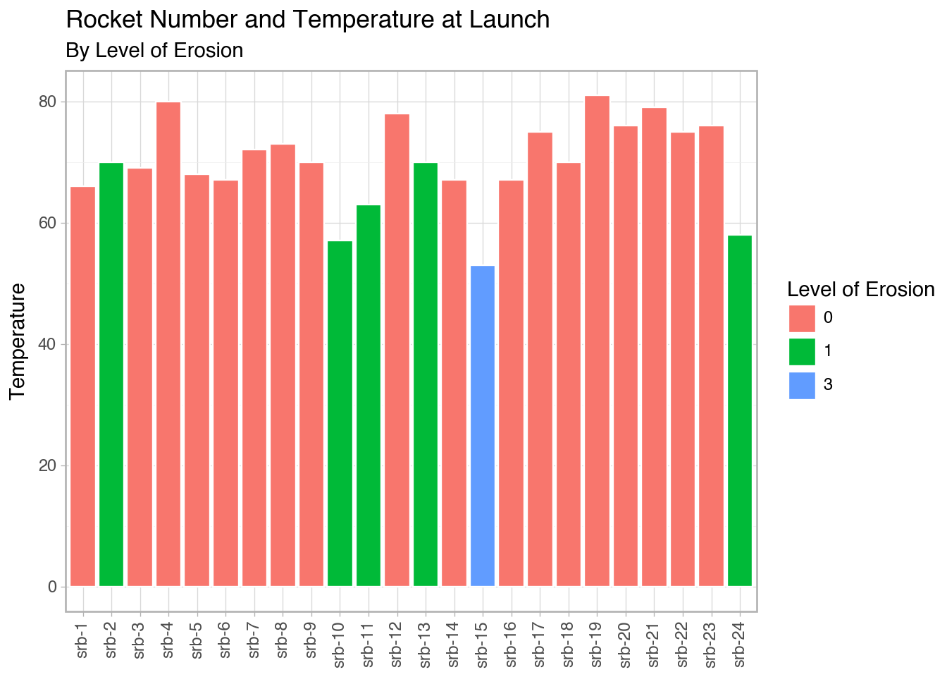
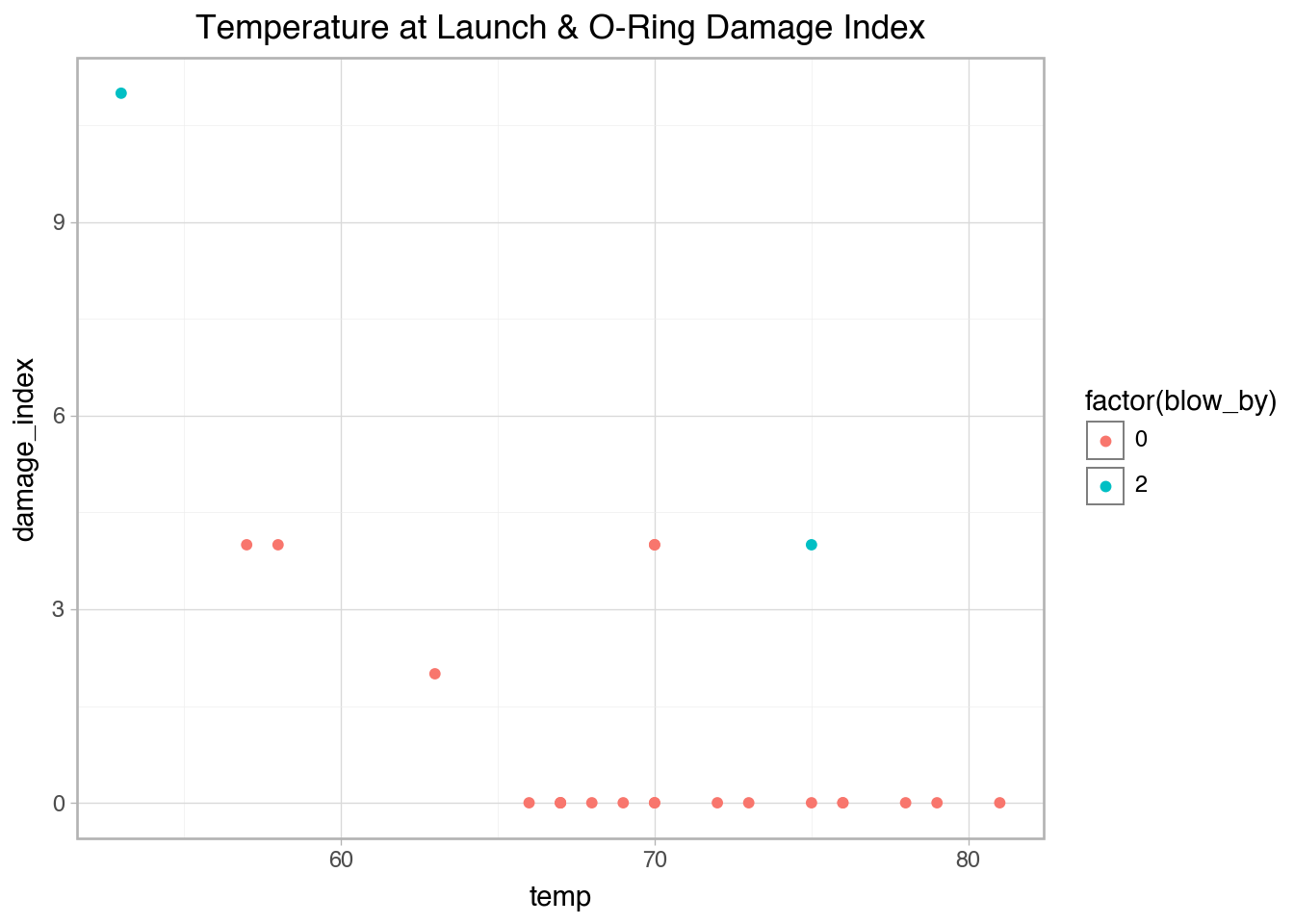
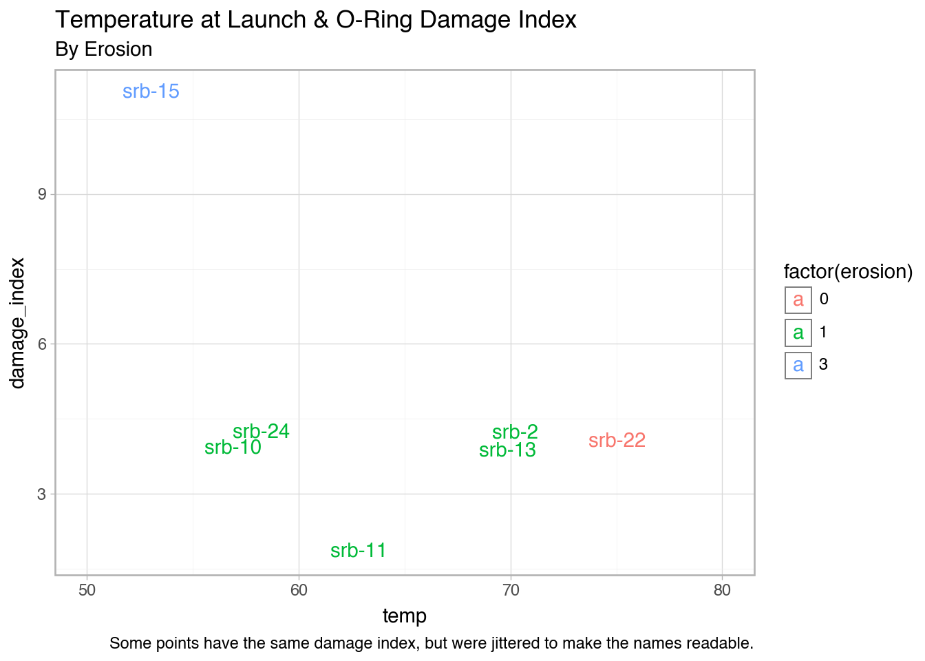
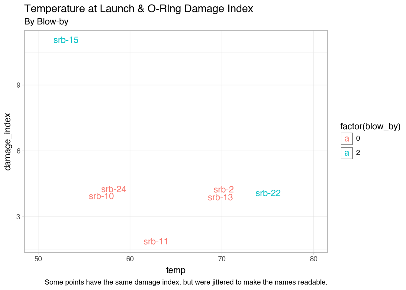
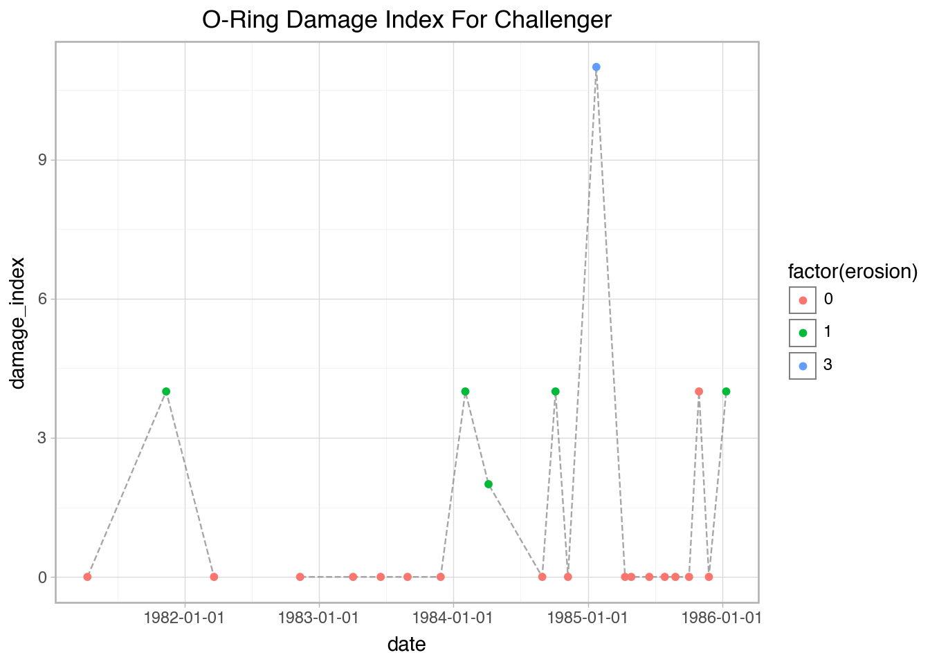
space = pd.DataFrame({'flight_number': ['51-C', '41-B', '61-C', '41-C', '1', '6', '51-A', '51-D', '5', '3', '2', '9', '41-D', '51-G', '7', '8', '51-B', '61-A', '51-I', '61-B', '41-G', '51-J', '4', '51-F'],
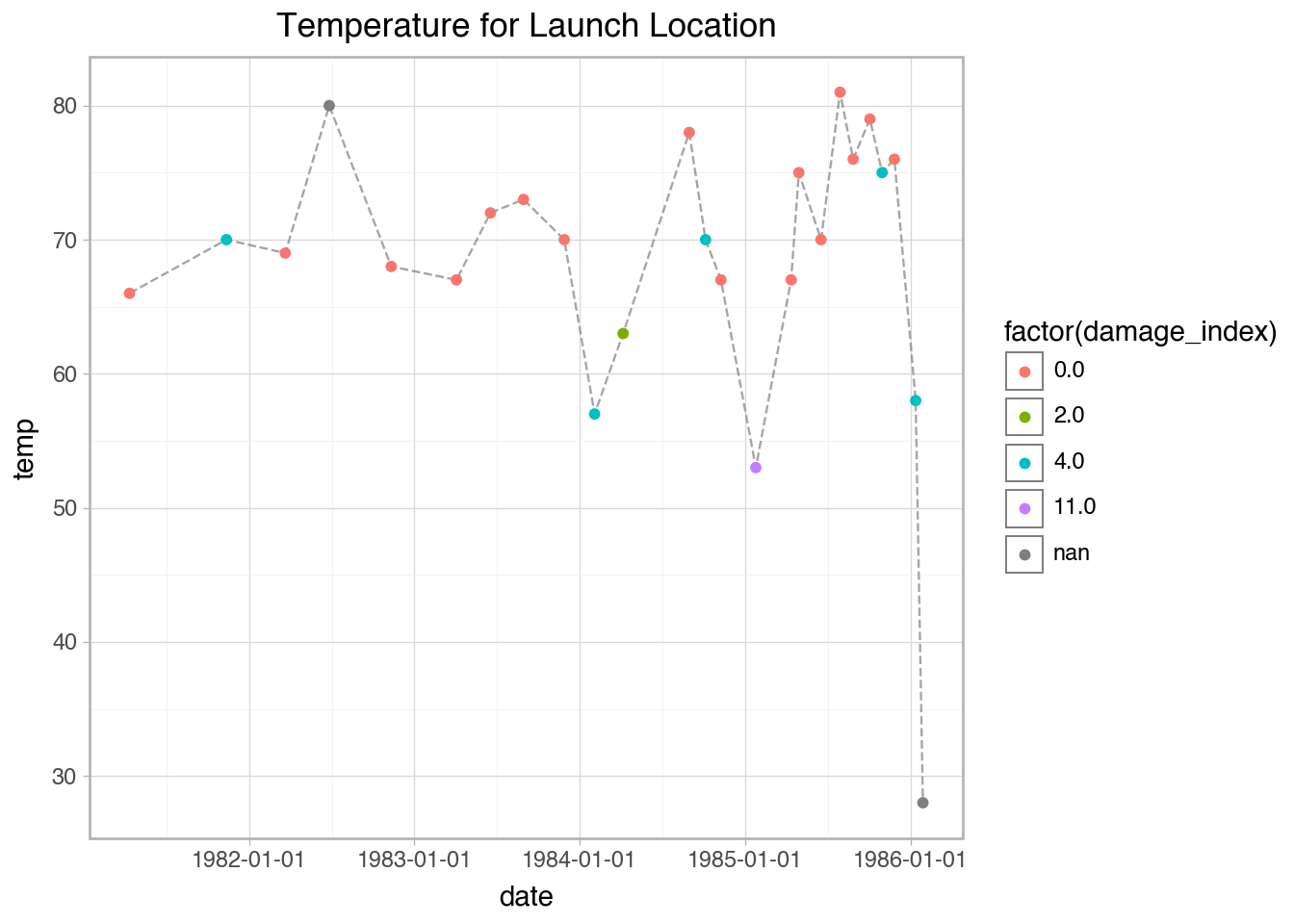
                      'date': ['01-24-85', '02-03-84', '01-12-86', '04-06-84', '04-12-81', '04-04-83', '11-08-84', '04-12-85', '11-11-82', '03-22-82', '11-12-81', '11-28-83', '08-30-84', '06-17-85', '06-18-83', '08-30-83', '04-29-85', '10-30-85', '08-27-85', '11-26-85', '10-05-84', '10-03-85', '06-27-82', '07-29-85'],
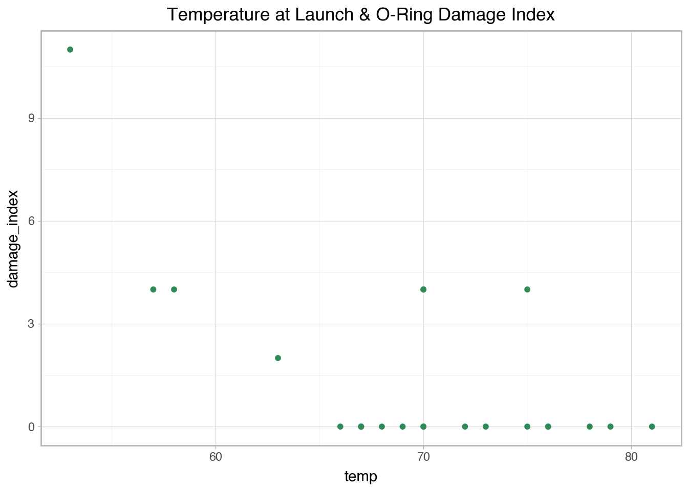
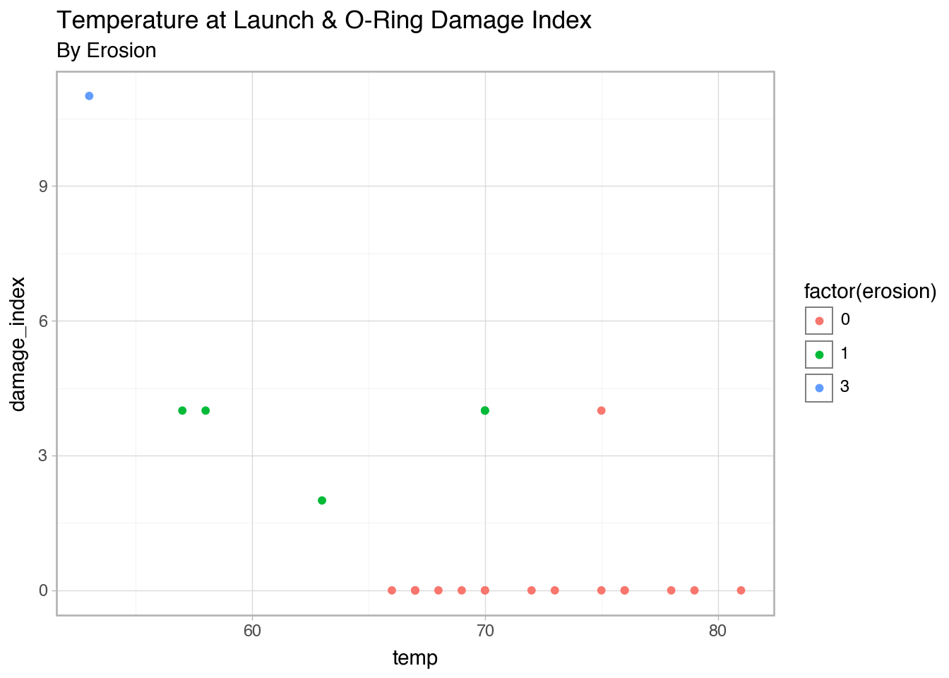
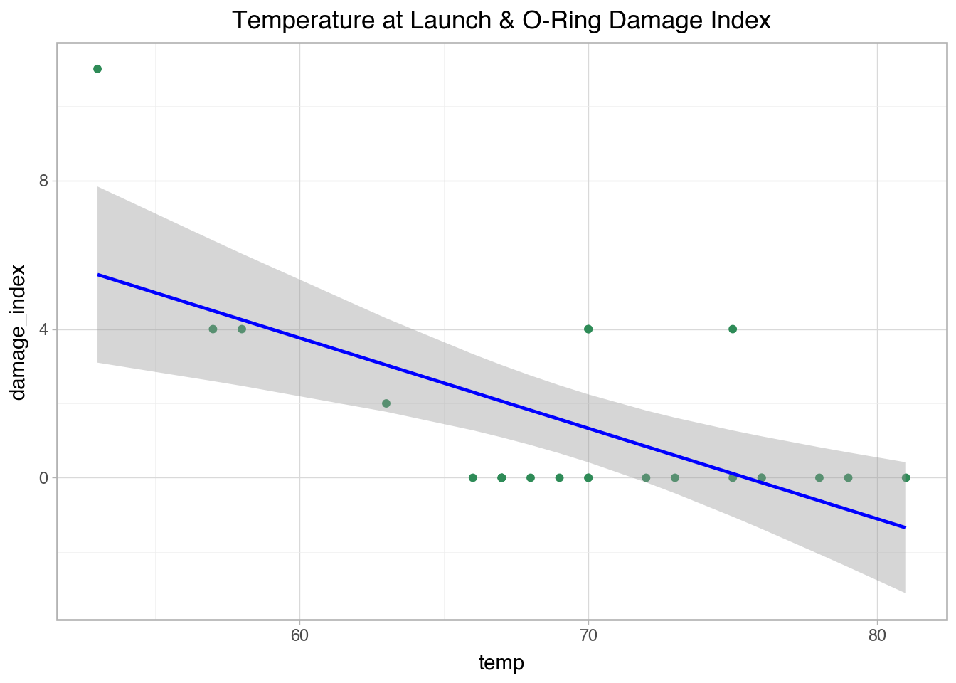
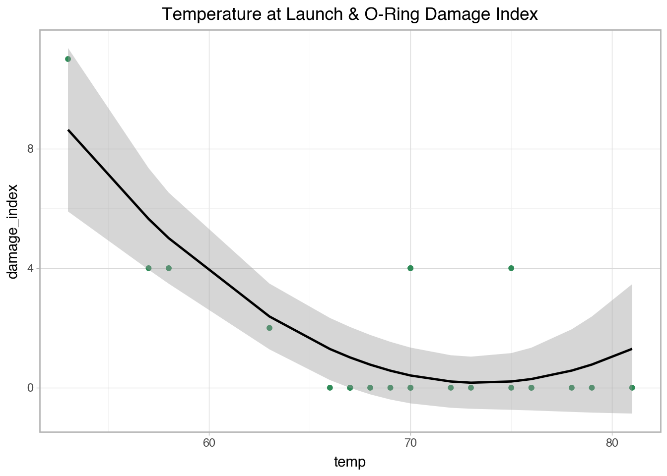
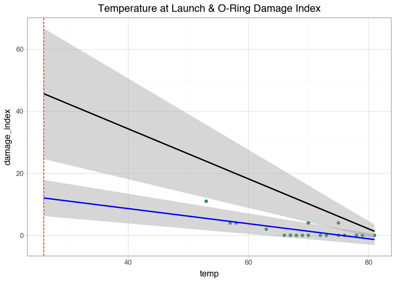
                      'temp': [53, 57, 58, 63, 66, 67, 67, 67, 68, 69, 70, 70, 70, 70, 72, 73, 75, 75, 76, 76, 78, 79, 80, 81],
                      'erosion': [3, 1, 1, 1, 0, 0, 0, 0, 0, 0, 1, 0, 1, 0, 0, 0, 0, 0, 0, 0, 0, 0, 0, 0],
                      'blow_by': [2, 0, 0, 0, 0, 0, 0, 0, 0, 0, 0, 0, 0, 0, 0, 0, 0, 2, 0, 0, 0, 0, 0, 0],
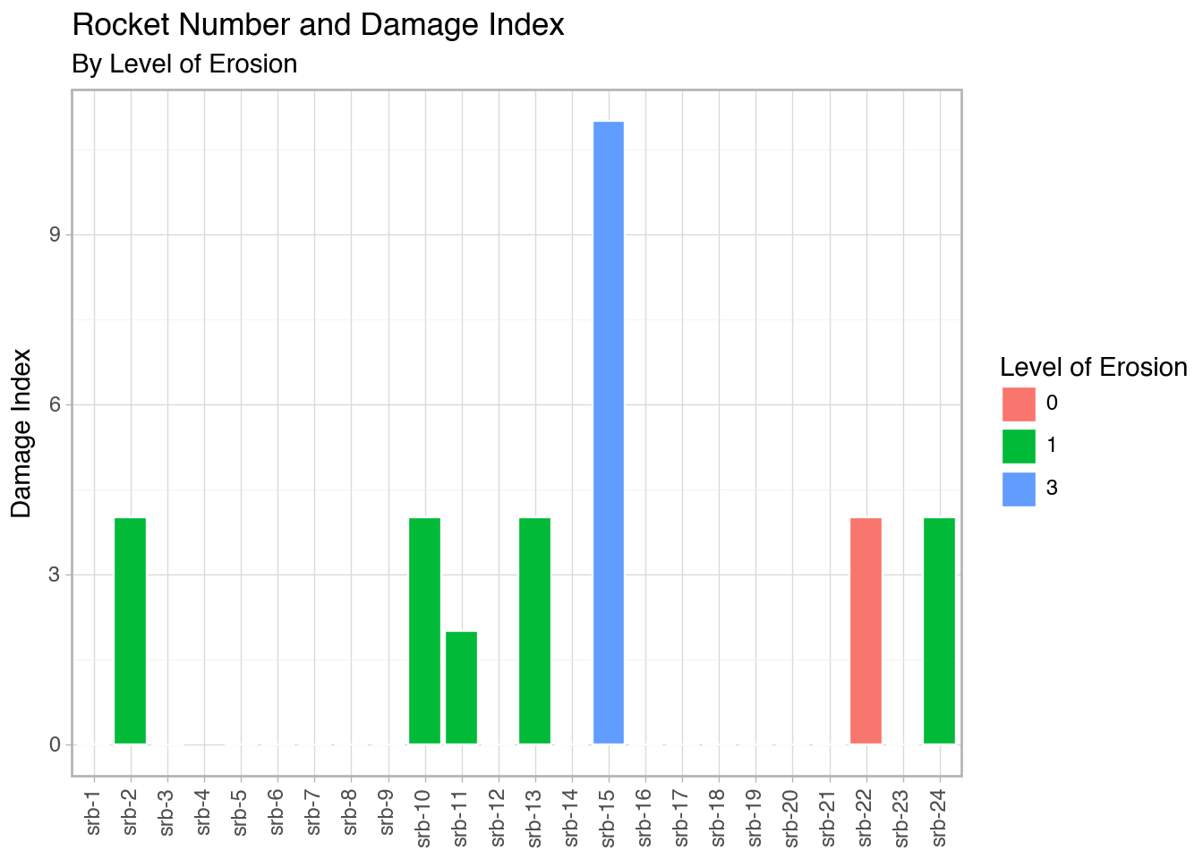
                      'damage_index': [11, 4, 4, 2, 0, 0, 0, 0, 0, 0, 4, 0, 4, 0, 0, 0, 0, 4, 0, 0, 0, 0, np.nan, 0],
                      'comments': ['Most erosion any flight; blow-by; back-up rings heated', 'Deep, extensive erosion', 'O-ring erosion on launch two weeks before Challenger', 'O-rings showed signs of heating, but no damage', 'Coolest (66 degrees) launch without O-ring problems', np.nan, np.nan, np.nan, np.nan, np.nan, 'Extent of erosion not fully known', np.nan, np.nan, np.nan, np.nan, np.nan, np.nan, 'No erosion. Soot found behind two primary O-rings', np.nan, np.nan, np.nan, np.nan, 'O-ring condition unknown; rocket casing lost at sea', np.nan]})

space['date'] = pd.to_datetime(space['date'])
space = space.sort_values('date', ascending = True)

space['srb_num'] = ['srb-1', 'srb-2', 'srb-3', 'srb-4', 'srb-5', 'srb-6', 'srb-7', 'srb-8', 'srb-9', 'srb-10', 'srb-11', 'srb-12', 'srb-13', 'srb-14', 'srb-15', 'srb-16', 'srb-17', 'srb-18', 'srb-19', 'srb-20', 'srb-21', 'srb-22', 'srb-23', 'srb-24']

space.head()
flight_number date temp erosion blow_by damage_index comments srb_num
4 1 1981-04-12 66 0 0 0.0 Coolest (66 degrees) launch without O-ring pro... srb-1
10 2 1981-11-12 70 1 0 4.0 Extent of erosion not fully known srb-2
9 3 1982-03-22 69 0 0 0.0 NaN srb-3
22 4 1982-06-27 80 0 0 NaN O-ring condition unknown; rocket casing lost a... srb-4
8 5 1982-11-11 68 0 0 0.0 NaN srb-5

Note: SRBs are solid rocket boosters, or simplisticly the systems that are responsible for putting space shuttles into space. Blow-by is a metric of gases escaping past the O-rings of SRBs (The paper has more information and diagrams).

From viewing the data it looks pretty good, so we could move ahead with visualizations and additional analyses. However, there are some inconsistencies between the data presented in the paper and the images of the O-ring failures in the paper’s figures. Originally the data for SRB-12 was written down incorrectly. SRB-12 was not the rocket set with erosion and it was actually the SRB-13 rocket. So we’re gonna make some changes to make sure the data matches the visuals below.

Code
space.loc[(space['srb_num'] == 'srb-13'), 'temp'] = 70
space.loc[(space['srb_num'] == 'srb-13'), 'erosion'] = 1
space.loc[(space['srb_num'] == 'srb-13'), 'damage_index'] = 4

space.loc[(space['srb_num'] == 'srb-12'), 'temp'] = 78
space.loc[(space['srb_num'] == 'srb-12'), 'erosion'] = 0
space.loc[(space['srb_num'] == 'srb-12'), 'damage_index'] = 0

We’ll also make the rocket number into a categorical variable for visualizations down the line.

Code
space['srb_num'] = pd.Categorical(space['srb_num'], categories = ['srb-1', 'srb-2', 'srb-3', 'srb-4', 'srb-5', 'srb-6', 'srb-7', 'srb-8', 'srb-9', 'srb-10', 'srb-11', 'srb-12', 'srb-13', 'srb-14', 'srb-15', 'srb-16', 'srb-17', 'srb-18', 'srb-19', 'srb-20', 'srb-21', 'srb-22', 'srb-23', 'srb-24'], ordered = True)

Lastly, before moving onto visuals, I also created another column that puts more focus on the specific SRBs; however, for the purposes of this post I do not go any further with these specific analyses. If you are interested in the dataset that is used for this post, you can find it in this folder.

Code
# space.to_csv(here('posts/2026-04-25-make-data-interesting/challenger_data.csv'))

spaced = space.loc[space.index.repeat(2)].reset_index(drop = True)

spaced['rocket'] = ['A', 'B'] * (len(spaced) // 2)

spaced.loc[(spaced['srb_num'] == 'srb-2') & (spaced['rocket'] == 'A'), 'erosion'] = 0 # srb-2 A did not have erosion
spaced.loc[(spaced['srb_num'] == 'srb-10') & (spaced['rocket'] == 'B'), 'erosion'] = 0 # srb-10 B did not have erosion
spaced.loc[(spaced['srb_num'] == 'srb-11') & (spaced['rocket'] == 'B'), 'erosion'] = 0 # srb-11 B did not have erosion
spaced.loc[(spaced['srb_num'] == 'srb-13') & (spaced['rocket'] == 'A'), 'erosion'] = 0 # srb-13 A did not have erosion
spaced.loc[(spaced['srb_num'] == 'srb-24') & (spaced['rocket'] == 'B'), 'erosion'] = 0 # srb-24 A did not have erosion

spaced.head()
flight_number date temp erosion blow_by damage_index comments srb_num rocket
0 1 1981-04-12 66 0 0 0.0 Coolest (66 degrees) launch without O-ring pro... srb-1 A
1 1 1981-04-12 66 0 0 0.0 Coolest (66 degrees) launch without O-ring pro... srb-1 B
2 2 1981-11-12 70 0 0 4.0 Extent of erosion not fully known srb-2 A
3 2 1981-11-12 70 1 0 4.0 Extent of erosion not fully known srb-2 B
4 3 1982-03-22 69 0 0 0.0 NaN srb-3 A

Investigation

Visuals

The first thing I wanted to look at was the level of erosion that was seen on the O-rings of the rockets and what that looked like for the different temperatures for any date with a Challenger flight.

Code
pn.ggplot.show(
  pn.ggplot(space, pn.aes('srb_num', 'temp'))
  + pn.geom_col(pn.aes(fill = 'factor(erosion)'), color = 'white')
  + pn.labs(title = 'Rocket Number and Temperature at Launch',
  subtitle = 'By Level of Erosion',
  x = '',
  y = 'Temperature',
  fill = 'Level of Erosion')
  + pn.theme_light()
  + pn.theme(axis_text_x = pn.element_text(rotation = 90))
)

So far from this visual, there really isn’t any trend that is noteworthy between level of erosion and the launch facility temperature.

This made me think about whether there were any issues for these specific rockets when examining the damage index reported after each flight. The sparce data here draws attention to only SRBs with damage reported.

Code
pn.ggplot.show(
  pn.ggplot(space, pn.aes('srb_num', 'damage_index'))
  + pn.geom_col(pn.aes(fill = 'factor(erosion)'), color = 'white')
  + pn.labs(title = 'Rocket Number and Damage Index',
  subtitle = 'By Level of Erosion',
  x = '',
  y = 'Damage Index',
  fill = 'Level of Erosion')
  + pn.theme_light()
  + pn.theme(axis_text_x = pn.element_text(rotation = 90))
)

We can see that SRB-15 had the highest damage index and also the only set of rockets with a high level of erosion.

One interesting note from the visualization is that SRB-22 rockets did not have any level of erosion around the O-rings but had a similar damage index to other rockets without any erosion.

So right now, we can note that SRB-15 and SRB-22 are rockets of interest as they may have something wrong with them. Let’s next examine our relationship of interest. Is there an association between launch facility temperature and O-ring damage?

Code
pn.ggplot.show(
  pn.ggplot(space, pn.aes('temp', 'damage_index'))
  + pn.geom_point(color = jpcolor)
  + pn.labs(title = 'Temperature at Launch & O-Ring Damage Index'
  )
  + pn.theme_light()
)

print(space.loc[space['temp'] < 55])

  flight_number       date  temp  erosion  blow_by  damage_index  \
0          51-C 1985-01-24    53        3        2          11.0   

                                            comments srb_num  
0  Most erosion any flight; blow-by; back-up ring...  srb-15  

From plotting the relationship, it appears that there is a negative association between the two variables. We can also now see that SRB-15, with the highest damage index is also the rocket that was launched at the lowest temperature (53°F).

I do not think we could attribute the damage solely to the temperature. We could also note that the SRB-15 had an erosion level of 3 and a blow-by value of 2, which indicates that the O-rings were suffering from the highest erosion and the highest blow-by.

Code
pn.ggplot.show(
  pn.ggplot(space, pn.aes('temp', 'damage_index'))
  + pn.geom_point(pn.aes(color = 'factor(erosion)'))
  + pn.labs(title = 'Temperature at Launch & O-Ring Damage Index',
  subtitle = 'By Erosion')
  + pn.theme_light()
)

When we examine the relationship while taking into consideration erosion, we can see that erosion appears to happen at lower temperature; however we can note that SRB-22 has a damage index of 4 with no apparent erosion at the O-rings.

Code
pn.ggplot.show(
  pn.ggplot(space, pn.aes('temp', 'damage_index'))
  + pn.geom_point(pn.aes(color = 'factor(blow_by)'))
  + pn.labs(title = 'Temperature at Launch & O-Ring Damage Index')
  + pn.theme_light()
)

We can see that the only rockets with indications of blow-by are from SRB-15 and SRB-22. With SRB-22 showing no indication of erosion, but shows blow-by. So some damage is showing up from blow-by past the O-rings in one or more of the rockets.

The following visuals just shows that SRB-15 seemed to have a lot of damage, but SRB-22 had damage but no indication of erosion.

Code
pn.ggplot.show(
  pn.ggplot(space.loc[space['damage_index'] > 0], pn.aes('temp', 'damage_index'))
  # + pn.geom_point(pn.aes(color = 'factor(erosion)'))
  + pn.geom_text(pn.aes(label = 'srb_num',
                        color = 'factor(erosion)'),
                 position = pn.position_jitter(random_state = 12345,
                                               height = .25,
                                               width = .25))
  # + pn.scale_color_discrete(limits = space['srb_num'].unique())
  + pn.scale_x_continuous(limits = [50, 80])
  + pn.labs(title = 'Temperature at Launch & O-Ring Damage Index',
            subtitle = 'By Erosion',
            caption = 'Some points have the same damage index, but were jittered to make the names readable.')
  + pn.theme_light()
  # + pn.theme(legend_position = 'none')
)

Code
pn.ggplot.show(
  pn.ggplot(space.loc[space['damage_index'] > 0], pn.aes('temp', 'damage_index'))
  + pn.geom_text(pn.aes(label = 'srb_num',
                        color = 'factor(blow_by)'),
                 position = pn.position_jitter(random_state = 12345,
                                               height = .25,
                                               width = .25))
  # + pn.scale_color_discrete(limits = space['srb_num'].unique())
  + pn.scale_x_continuous(limits = [50, 80])
  + pn.labs(title = 'Temperature at Launch & O-Ring Damage Index',
            subtitle = 'By Blow-by',
            caption = 'Some points have the same damage index, but were jittered to make the names readable.')
  + pn.theme_light()
  # + pn.theme(legend_position = 'none')
)

Modeling Visuals

Now we can see how we would model the relationship between temperature and O-ring damage index. From the previous visuals, we have some indication that there is a linear relationship between temperature and damage index. Plotting it, we can see that that appears to be the case.

Code
pn.ggplot.show(
  pn.ggplot(space, pn.aes('temp', 'damage_index'))
  + pn.geom_point(color = jpcolor)
  + pn.geom_smooth(method = 'lm',
                   color = 'blue')
  + pn.labs(title = 'Temperature at Launch & O-Ring Damage Index')
  + pn.theme_light()
)

Some may stop there, but what if this relationship is actually a curvilinear association. Visualizing this starts to tell a different picture.

Code
pn.ggplot.show(
  pn.ggplot(space, pn.aes('temp', 'damage_index'))
  + pn.geom_point(color = jpcolor)
  + pn.geom_smooth(method = 'lm',
                   formula = 'y ~ x + I(x**2)')
  + pn.labs(title = 'Temperature at Launch & O-Ring Damage Index')
  + pn.theme_light()
)

This curvilinear association starts to look like the relationship is U-shaped. Where damage to the O-rings may be higher at much lower temperatures and may become slightly higher as temperatures grow past 80°F.

Let’s look at a plot to see if there is any trend based on the time of the year that these Challenger flights occurred.

Code
pn.ggplot.show(
  pn.ggplot(space, pn.aes('date', 'damage_index'))
  + pn.geom_line(group = 1, alpha = .7, linetype = 'dashed', color = 'gray')
  + pn.geom_point(pn.aes(color = 'factor(erosion)'))
  + pn.labs(title = 'O-Ring Damage Index For Challenger')
  + pn.theme_light()
)

The trend below shows some information about damage occurring when it was in the winter months. However, that is not the case always as 1983 does not follow the same trend.

Now, before we get to modeling, let’s add some context. The date of the Challenger launch that ended in a catastrophy was on January 28th 1986. The temperature was predicted to be anywhere from 26°F to 29°F, which is much colder than the rest of our data. Let’s add some hypothetical data to see what that would look like with our current data. For simplicity, we’ll take the average of the projected range to see what that would look like.

Code
space_extra = space[['date', 'temp', 'damage_index']]

space2 = pd.DataFrame({'date': ['1986-1-28'],
                       'temp': [round(np.mean([26, 27, 28, 29]))],
                       'damage_index': [np.nan]})
space2['date'] = pd.to_datetime(space2['date'])

space_extra = pd.concat([space_extra, space2])

pn.ggplot.show(
  pn.ggplot(space_extra, pn.aes('date', 'temp'))
  + pn.geom_line(group = 1, alpha = .7, linetype = 'dashed', color = 'gray')
  + pn.geom_point(pn.aes(color = 'factor(damage_index)'))
  + pn.labs(title = 'Temperature for Launch Location')
  + pn.theme_light()
)

From the visual above, we can see that there was a huge dropoff in temperature from all previous Challenger launches. So in this scenario, do you launch? Do you wait for warmer weather? Will the O-rings hold? What level of damage would you expect from the O-rings? What level of risk is acceptable?

Let’s also plot our models to see where the temperature would be in relationship to our fitted model.

Code
pn.ggplot.show(
  pn.ggplot(space, pn.aes('temp', 'damage_index'))
  + pn.geom_point(color = jpcolor)
  + pn.geom_vline(xintercept = 26,
                  color = 'red',
                  linetype = 'dashed')
  + pn.geom_smooth(method = 'lm', color = 'blue', fullrange = True)
  + pn.geom_smooth(method = 'lm', formula = 'y ~ x + I(x**2)', fullrange = True)
  + pn.labs(title = 'Temperature at Launch & O-Ring Damage Index'
  )
  + pn.theme_light()
)

Depending on our model, we could see a damage index that could range from ~10 for a linear regression to much higher if we would test our curvilinear regression. With such a small dataset, I think the curvilinear model appears to be overfitting so we will stick with the linear regressino.

We have one card up our sleeves that NASA did not readily have at the time and that is computing. We no longer have to utilize a frequentist approach to model the damage index. We also can set a prior based on our prior information given that we have a smaller dataset.

Note: Since I will be showing linear regressions first, I wanted to show typical weakly-informative priors and then trying the model out with more informative priors to compare those models. Since we have the intercept (alpha/a), the beta (b) parameter, and the variance (sigma) in our linear regression, we can set priors for each of these parameters. We have some understanding from our previous visuals that there is a negative association between temperature and O-ring damage, so we can set a prior for beta as negative. We also can assume that if our linear model is correct that damage will increase as temperature drops so our intercept (the value of y [damage index] at zero) would be higher. This can also then inform our priors so we can now move ahead with our two linear models.

Modeling

First, let’s fill the na value for damage to be the median for the rocket that was lost at sea.

Code
space['damage_index'] = np.where(space['damage_index'].isna(), space['damage_index'].median().round(), space['damage_index'])

We’ll be running this model in Stan and while there are other options that have an easier beginner userface, I wanted to build the model outright given that it is a fairly “easy” model to write out in Stan. For the models tested, all of the stan models can be found in this post’s folder here.

This will not be a complete walkthrough of bayesian workflows, so I won’t go into too much detail.

Code
stan_dict = {
  'N': space.shape[0],
  'x': space['temp'].astype(int).to_numpy(),
  'y': space['damage_index'].astype(int).to_numpy()
}

stan_dict
{'N': 24,
 'x': array([66, 70, 69, 80, 68, 67, 72, 73, 70, 57, 63, 78, 70, 67, 53, 67, 75,
        70, 81, 76, 79, 75, 76, 58]),
 'y': array([ 0,  4,  0,  0,  0,  0,  0,  0,  0,  4,  2,  0,  4,  0, 11,  0,  0,
         0,  0,  0,  0,  4,  0,  4])}

Priors

Code
prior_df = pd.DataFrame({'alpha_less_inform': np.random.normal(0, 2, 100),
                         'alpha_more_inform': np.random.normal(20, 5, 100),
                         'beta_less_inform': np.random.normal(0, 2, 100),
                         'beta_more_inform': np.random.normal(-1, 2, 100),
                         'sigma_less_inform': np.random.exponential(1, 100),
                         'sigma_more_inform': np.random.exponential(1, 100)})

pn.ggplot.show(
  pn.ggplot(prior_df.melt(),
            pn.aes('value'))
  + pn.geom_density(color = jpcolor)
  + pn.facet_wrap('variable',
                  scales = 'free',
                  ncol = 2)
  + pn.theme_light()
)

Above are quick visuals comparing our less and more informative priors. We could then compare our models to see how they can predict lower temperatures.

Weakly-Informative Linear Regression

We will start off with our weakly-informative linear model.

The first thing we’ll check is to see if the diagnostic information looks okay.

Code
print(line_diagnose.sort_values('R_hat', ascending = False).head())
                  Mean      MCSE    StdDev       MAD         5%        50%  \
a             2.357030  0.045292  1.968030  1.944980  -0.832564   2.346730   
b            -0.016167  0.000670  0.028856  0.028514  -0.063897  -0.016197   
lp__        -37.917700  0.024608  1.258520  1.012020 -40.414100 -37.584700   
log_lik[11]  -1.903140  0.002981  0.157928  0.162261  -2.167340  -1.899590   
log_lik[19]  -1.968070  0.003565  0.182584  0.179859  -2.281720  -1.961580   

                   95%  ESS_bulk  ESS_tail  ESS_bulk/s    R_hat  
a             5.667220   1922.06   2700.93     4642.67  1.00299  
b             0.030751   1875.41   2692.51     4529.98  1.00287  
lp__        -36.552500   2815.32   3552.22     6800.30  1.00189  
log_lik[11]  -1.651480   2776.51   3298.32     6706.54  1.00141  
log_lik[19]  -1.681810   2580.77   3047.99     6233.76  1.00124  

From what we see, it looks okay and we can move forward.

Code
iline = azb.from_cmdstanpy(
    posterior = line_fit,
    prior = line_prior,
    posterior_predictive = ['y_rep'],
    prior_predictive = ['y_rep'],
    observed_data = {'y_rep': stan_dict['y']},
    log_likelihood = 'log_lik'
    )

We can then look at the posterior distributions of our parameters.

Code
azp.plot_dist(
    iline,
    kind = 'kde',
    col_wrap = 1,
    var_names = ['a', 'b', 'sigma']
)

From our analyses, we can see that the posterior distribution average if 2.4 for our y-intercept. So when temperature is at 0°F, we have an average damage index of 2.4.

The association between temperature and damage index is at -0.02 so for every 1°F increase there is a -0.02 decrease in damage index. So the negative association holds true, but the decrease is only 0.02 so a 10°F decrease in temperature would only be an increase of .2 damage index.

Code
azp.plot_forest(
    iline,
    var_names = ['a', 'b', 'sigma']
)

Plotting our parameters, we can see that there is a wide amount of variation in our damage index when temperature is 0°F (y-intercept). It ranges from less than 0 (not possible) to over 5. From this model, we can conclude that at a temperature of 0 there would most likely be some damage to the rockets.

We have much less variation in the slope, or the relationship between between temperature and O-ring damage.

Code
azp.plot_prior_posterior(
    iline,
    var_names = ['a'],
    kind = 'kde'
)

azp.plot_prior_posterior(
    iline,
    var_names = ['b'],
    kind = 'kde'
)

azp.plot_prior_posterior(
    iline,
    var_names = ['sigma'],
    kind = 'kde'
)

Plotting our priors to the posterior distributions, we can see that our priors were either slightly off (intercept and sigma) or extremely off (beta).

Code
azp.plot_ppc_dist(iline, kind = 'kde', num_samples = 100)

Comparing the distribution of our posteriors to the actual data distribution shows us that a linear regression may not be the most appropriate model to be testing this association with. We have distributions that contain values that are negative which is problematic. We cannot have negative damage indices.

Code
azp.plot_ppc_tstat(iline, t_stat = 'mean')
azp.plot_ppc_tstat(iline, t_stat = 'median')
azp.plot_ppc_tstat(iline, t_stat = 'std')

Comparing common fit statistics like mean, median, and standard deviations where we calculate t-like statistics to compare to the actual data shows that the data produced is not much different overall. However, with the previous plot showing negative values in the majority of the distribution, we can assume we should try a different model.

Code
azp.plot_trace(iline)

Finally, our trace plots overall look acceptable.

More Informative Linear Regression

Before we move to a more appropriate model, let’s look at the linear regression with more informative priors.

Code
print(line_diagnose2.sort_values('R_hat', ascending = False).head())
                 Mean      MCSE    StdDev       MAD         5%        50%  \
a            17.99530  0.084740  3.935430  3.813250  11.407500  18.062000   
b            -0.23748  0.001208  0.055909  0.053942  -0.325698  -0.238803   
log_lik[17]  -1.67295  0.003010  0.153657  0.147045  -1.938390  -1.662510   
lp__        -31.32490  0.032039  1.369190  1.034560 -34.046000 -30.946600   
log_lik[15]  -5.63413  0.033555  1.740530  1.651300  -8.831750  -5.397950   

                   95%  ESS_bulk  ESS_tail  ESS_bulk/s    R_hat  
a            24.216200   2182.66   2255.64     2295.12  1.00136  
b            -0.143905   2172.21   2216.99     2284.13  1.00135  
log_lik[17]  -1.442580   2844.87   2509.39     2991.45  1.00107  
lp__        -29.914300   2123.74   2424.88     2233.17  1.00105  
log_lik[15]  -3.259890   2622.99   3148.87     2758.14  1.00104  

Our second linear regression also shows acceptable diagnostics.

Code
iline2 = azb.from_cmdstanpy(
    posterior = line_fit2,
    prior = line_prior2,
    posterior_predictive = ['y_rep'],
    prior_predictive = ['y_rep'],
    observed_data = {'y_rep': stan_dict['y']},
    log_likelihood = 'log_lik'
    )
Code
azp.plot_dist(
    iline2,
    kind = 'kde',
    col_wrap = 1,
    var_names = ['a', 'b', 'sigma']
)

From this model, we have our posterior distribution averages for our parameters. Interestingly at 0°F, the damage index would likely be 18. The association between temperature and damage index reflected that for every 1°F increase, there was a 0.24 decrease in damage index. Now, for a 10°F decrease, there would be a 2.4 increase in damage index.

This reflects how more informative priors can be useful for smaller datasets.

Code
azp.plot_forest(
    iline2,
    var_names=['a', 'b', 'sigma']
)

Code
azp.plot_prior_posterior(
    iline2,
    var_names = ['a'],
    kind = 'kde'
)

azp.plot_prior_posterior(
    iline2,
    var_names = ['b'],
    kind = 'kde'
)

azp.plot_prior_posterior(
    iline2,
    var_names = ['sigma'],
    kind = 'kde'
)

Code
azp.plot_ppc_dist(iline2, kind = 'kde', num_samples = 100)

As with our previous model, we can see our posterior predictive distributions do not follow our data very well.

Code
azp.plot_ppc_tstat(iline2, t_stat = 'mean')
azp.plot_ppc_tstat(iline2, t_stat = 'median')
azp.plot_ppc_tstat(iline2, t_stat = 'std')

Similar findings are also seen with our posterior predictive checks

Code
azp.plot_trace(iline2)

Zero-Inflated Poisson Model

Let’s now do all the same things for a zero-inflated model. This model would treat O-ring damage as a count variable, which would be appropriate given that there cannot be negative damage.

Code
print(count_diagnose.sort_values('R_hat', ascending = False).head())
               Mean      MCSE    StdDev       MAD        5%       50%  \
y_rep[1]   1.529880  0.033078  2.932730  0.000000  0.000000  0.000000   
beta_psi   0.015648  0.000339  0.018899  0.018976 -0.016385  0.015950   
alpha_psi -0.000379  0.018102  0.994878  0.976714 -1.571130 -0.017029   
logit_psi  0.907235  0.005667  0.465994  0.463543  0.162189  0.887682   
y_rep[12]  2.111000       NaN  4.420870  0.000000  0.000000  0.000000   

                 95%  ESS_bulk  ESS_tail  ESS_bulk/s    R_hat  
y_rep[1]    8.000000   8021.27   7912.33     3145.60  1.00146  
beta_psi    0.045705   3137.61   3264.18     1230.43  1.00118  
alpha_psi   1.696960   3050.45   3017.70     1196.26  1.00090  
logit_psi   1.693470   6852.13   4970.67     2687.11  1.00079  
y_rep[12]  12.000000   7662.92   6795.75     3005.06  1.00069  

Model still looks good based on these fit indices.

Code
icount = azb.from_cmdstanpy(
    posterior = count_fit,
    prior = count_prior_fit,
    posterior_predictive = ['y_rep'],
    prior_predictive = ['y_rep'],
    observed_data = {'y_rep': stan_dict['y']},
    log_likelihood = 'log_lik'
    )
Code
azp.plot_dist(
    icount,
    kind = 'kde',
    col_wrap = 1,
    var_names = ['alpha_psi', 'beta_psi',
                  'alpha_lam', 'beta_lam',
                  'psi', 'lam']
)

While there are several parameters from the zero-inflated and poisson models, I am going to focus on the following two parameters because they are the most applicable to our SRBs and O-ring damage.

\(\psi\): The average probability of zero damage index.

\(\lambda\): The aerage expected damage index when the observations are not zero.

The average posterior probability of no damage index is 70%, so it is more likely for zeros to be present. This tracks as our data is mainly comprised of 0 damage index values. When observations are not zero, the average damage index would be 4.7.

Code
azp.plot_forest(
    icount,
    var_names = ['alpha_psi', 'beta_psi',
                  'alpha_lam', 'beta_lam',
                  'psi', 'lam']
)

Code
azp.plot_prior_posterior(
    icount,
    var_names = ['alpha_psi', 'beta_psi',
                  'alpha_lam', 'beta_lam'],
    kind = 'kde'
)

Looking at the linear parameters for calculating the sections for the zero-inflated and poisson models, the intercepts follow the priors well, but the beta parameters are similar to the previous models.

Code
azp.plot_ppc_dist(icount, kind = 'kde', num_samples = 100)

Code
azp.plot_ppc_dist(icount, kind = 'ecdf', num_samples = 100)

While not amazing, this model seems the best in comparison to the impossible values from the linear models.

Code
azp.plot_ppc_tstat(icount, t_stat = 'mean')
azp.plot_ppc_tstat(icount, t_stat = 'std')

The posterior predictive checks also seem better than the previous models.

Code
azp.plot_trace(icount)

Finally, the trace plots look acceptable.

Model Comparisons

We can compare the models to see which is the best fitting model.

Code
compare_df = azs.compare({'linear_model': iline,
                          'informed_linear_model': iline2,
                          'count_model': icount})
azp.plot_compare(compare_df)

Comparing the models indicates that a zero-inflated poisson model seems like the most accurate model. So while it may be the better model, we’ll calculate predictions for each of the models to see what the average posterior damage index, standard deviation, and 95% credible intervals would be.

Predictions at 26°F-29°F

Let’s now see what the predicted damage index would be for each of our models at temperatures of 26°F, 27°F, 28°F, and 29°F.

Code
linedf = line_fit.draws_pd()

line_a = linedf.filter(regex = r'^a$')
line_b = linedf.filter(regex = r'^b$')

new_temp = [26, 27, 28, 29]

fit_temp = [line_a.to_numpy() + line_b.to_numpy() * i for i in new_temp]
fit_temp = pd.DataFrame(np.column_stack([i[:,0] for i in fit_temp]))

fit_temp.columns = [[f'temp{i}' for i in new_temp]]

gt.show(gt(pd.DataFrame({'avg': fit_temp.mean().round(),
              'std': fit_temp.std().round(2),
              'lower_95_ci': fit_temp.quantile(.025).round(2),
              'upper_95_ci': fit_temp.quantile(.975).round(2)})).tab_header(title = 'Linear Regression - Predictions'))
Linear Regression - Predictions
avg std lower_95_ci upper_95_ci
2.0 1.26 -0.54 4.42
2.0 1.23 -0.52 4.35
2.0 1.21 -0.48 4.29
2.0 1.18 -0.44 4.22
Code
linedf2 = line_fit2.draws_pd()

line_a2 = linedf.filter(regex = r'^a$')
line_b2 = linedf.filter(regex = r'^b$')

new_temp = [26, 27, 28, 29]

fit_temp2 = [line_a2.to_numpy() + line_b2.to_numpy() * i for i in new_temp]
fit_temp2 = pd.DataFrame(np.column_stack([i[:,0] for i in fit_temp2]))

fit_temp2.columns = [[f'temp{i}' for i in new_temp]]

gt.show(gt(pd.DataFrame({'avg': fit_temp2.mean().round(),
              'std': fit_temp2.std().round(2),
              'lower_95_ci': fit_temp2.quantile(.025).round(2),
              'upper_95_ci': fit_temp2.quantile(.975).round(2)})).tab_header(title = 'Linear Regression w/ Informative Priors - Predictions'))
Linear Regression w/ Informative Priors - Predictions
avg std lower_95_ci upper_95_ci
2.0 1.26 -0.54 4.42
2.0 1.23 -0.52 4.35
2.0 1.21 -0.48 4.29
2.0 1.18 -0.44 4.22
Code
countdf = count_fit.draws_pd()

logit_psi = []
for i in new_temp:
  logit_list = countdf['alpha_psi'] + countdf['beta_psi'] * i
  logit_psi.append(logit_list)

lambda_psi = []
for i in new_temp:
  lambda_list = countdf['alpha_lam'] + countdf['beta_lam'] * i
  lambda_psi.append(lambda_list)

psi_samples = []
for i in logit_psi:
  psi_sample_list = 1 / (1 + np.exp(-i))
  psi_samples.append(psi_sample_list)

lambda_samples = []
for i in lambda_psi:
  lambda_sample_list = np.exp(i)
  lambda_samples.append(lambda_sample_list)

struct_zero = [np.random.binomial(1, i) for i in psi_samples]
count_temp = [np.where(i == 1,
                      0,
                      np.random.poisson(j)) for i, j in zip(struct_zero, lambda_samples)]

count_temp_df = pd.DataFrame(np.column_stack(count_temp))
count_temp_df.columns = [[f'temp{i}' for i in new_temp]]

gt.show(gt(pd.DataFrame({'avg': count_temp_df.mean().round(),
              'std': count_temp_df.std().round(2),
              'lower_95_ci': count_temp_df.quantile(.025).round(2),
              'upper_95_ci': count_temp_df.quantile(.975).round(2)
              })).tab_header(title = 'Zero-Inflated Poisson Regression - Predictions'))
Zero-Inflated Poisson Regression - Predictions
avg std lower_95_ci upper_95_ci
1.0 1.8 0.0 6.0
1.0 1.73 0.0 6.0
1.0 1.8 0.0 6.0
1.0 1.8 0.0 6.0

Takeaways

The takeaway here is that those that were responsible for approving the launch of Challenger were in a difficult situation. They had to take into consideration several different factors, in addition to temperature, that were not mentioned in this post. Unfortunately, this did lead to a loss of lives and ultimately to how SRBs were created to take into account issues with the O-rings.

These models show that on average we predicted a low damage index, but the credible intervals indicate higher damage indices that could have shown damage that could have also led to the catastrophe. This shows how difficult it is when there are high stakes for modeling choices.

Citation for the book.

Tufte, E. (1997). Visual explanations: Images and quantities, evidence and narrative. Cheshire, CT: Graphics Press.